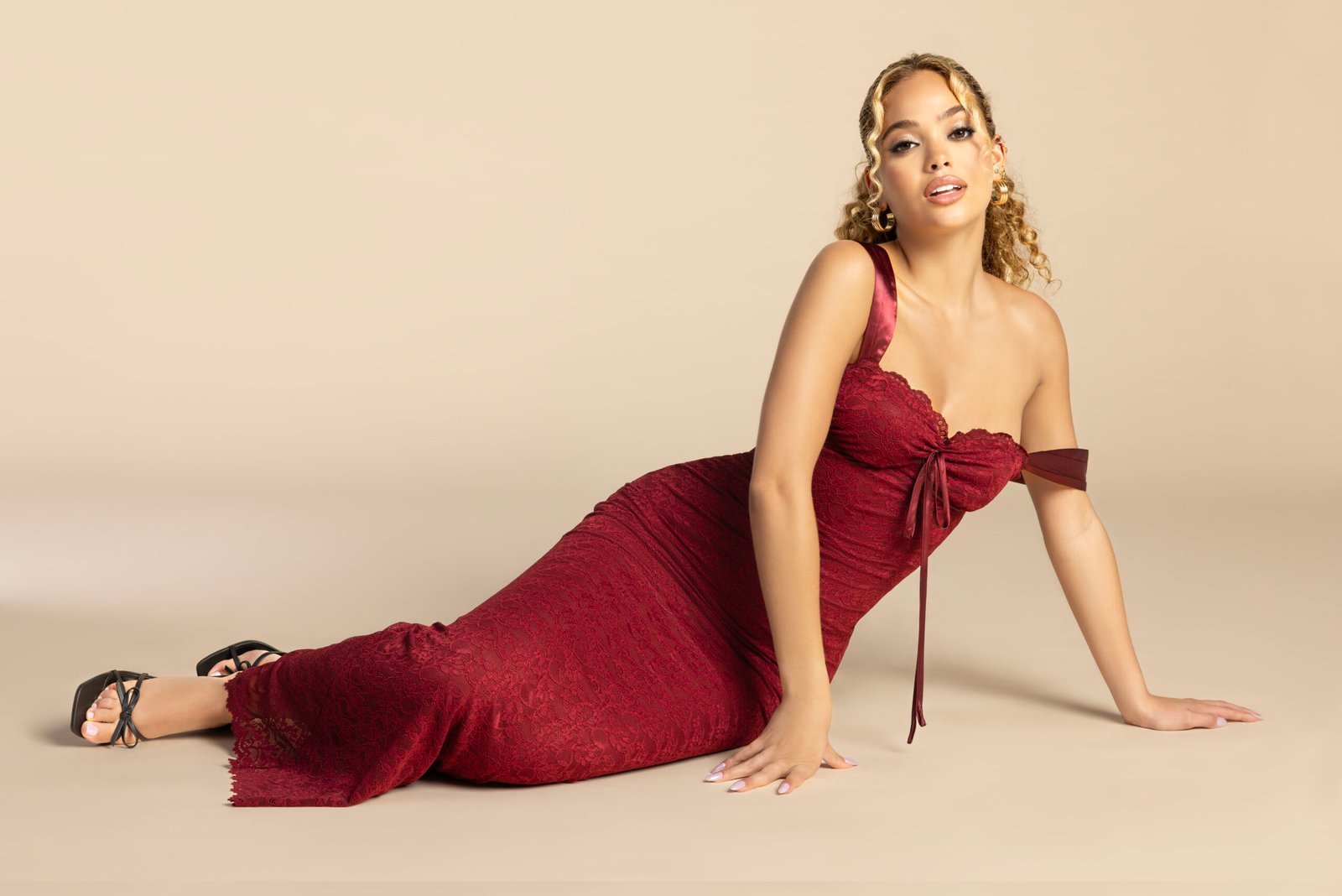
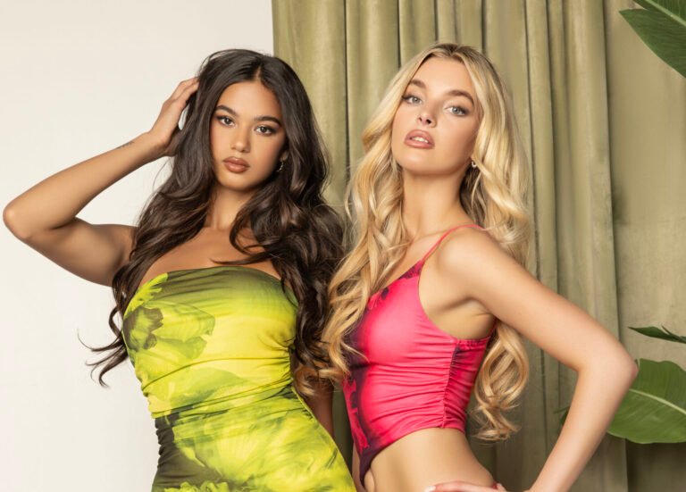
How to Maintain Brand Identity While Updating Seasonal Product Photos
In eCommerce, your product photos are more than just visuals—they’re digital ambassadors of your brand. They tell your story, build trust, and differentiate you in a crowded marketplace. Naturally, seasonal updates to your product imagery help you stay relevant and timely—but if not done carefully, these updates can dilute your brand identity.
So how can you adapt your product photos for different seasons—spring, summer, fall, winter—without losing the look and feel your customers know and trust? This blog takes a deeper look into maintaining brand identity while refreshing visuals for seasonal marketing.
✅ What is Brand Identity in Product Photography?
Before we jump into seasonal updates, let’s clarify what brand identity means in the context of product photography:
Visual Tone: The consistent mood of your images—minimal, bold, luxurious, earthy, etc.
Color Palette: A selection of brand-approved colors that appear across backgrounds, props, shadows, and highlights.
Editing Style: Levels of brightness, contrast, saturation, and retouching techniques you use.
Composition Rules: Consistent framing, angles, and spacing used in all product shots.
Background Style: Whether it’s plain white, textured, gradient, or lifestyle-focused.
Shadowing: Drop shadows, natural shadows, reflection—whatever creates a recognizable depth.
These elements together create a visual language that customers subconsciously associate with your brand. The challenge is keeping that language intact—even when the visuals evolve with the seasons.
🌸 Why Seasonal Updates are Important
Seasonal edits do more than make your product look trendy—they make it feel timely and relevant to your target audience.
For example:
Spring evokes freshness, rebirth, and minimalism.
Summer demands vibrant colors, sunlight, and energy.
Autumn is cozy, warm, and textured.
Winter speaks to luxury, calmness, or festivity.
Shoppers are emotionally driven by these seasonal cues. The right editing can trigger those emotions and lead to higher engagement and conversion rates. But to keep your customers loyal, you can’t lose your brand’s identity in the process.

🧱 Step 1: Build a Strong, Recognizable Visual Foundation
Before you make any seasonal edits, establish a clear brand photography guide. This document ensures that no matter the season, your visuals always stay on-brand.
What should it include?
Primary and secondary color palettes
Approved background and lighting setups
Shadow styles (natural, drop, reflection)
Cropping ratios and margins
Retouching levels (e.g., high-end for luxury, minimal for organic brands)
File naming conventions and formats
Once your foundation is in place, you can confidently make seasonal adjustments without starting from scratch each time.
🍂 Step 2: Use Seasonal Color Theory Within Your Brand Palette
Seasonal updates often start with color adjustments, but this doesn’t mean using off-brand hues. Instead, adapt your existing brand palette to fit seasonal color psychology.
Examples:
Spring: Use your lightest tones with added brightness or pastel overlays.
Summer: Boost saturation in your brand colors, but stay within your approved range.
Autumn: Add warmth (orange, brown, gold) to your neutral tones using color grading.
Winter: Cool down your whites and blues for a clean, premium feel. Subtle silver or deep tones work great for luxury brands.
✏️ Tip: Always apply color changes through adjustment layers or LUTs to retain brand colors and avoid image degradation.
🎯 Step 3: Modify the Mood, Not the Message
You don’t need to overhaul your style every season. Small tweaks can dramatically shift the mood while keeping your brand voice strong.
What can change:
Background texture (e.g., from plain white to a soft linen for autumn)
Lighting direction or warmth
Prop choice (a single pinecone or flower stem—not full-on décor)
Depth of field or subtle blur
What shouldn’t change:
Product angle
Logo placement
Core color tones
Editing depth (don’t go from natural to hyper-retouched or vice versa)
By editing the mood, not the message, you keep the product familiar while refreshing its seasonal appeal.

📷 Step 4: Keep Composition Consistent
No matter what season you’re designing for, your product framing, angle, and placement should stay consistent.
Why?
Helps with customer recognition across ads, social, and product pages
Ensures consistency across your online catalog
Makes your brand look organized and trustworthy
Even when creating seasonal banners or promotional creatives, stick to your grid system or image hierarchy. If your product is always centered, don’t suddenly shift it to a side crop just because it’s fall.
🎨 Step 5: Use Props to Subtly Signal the Season
Props are powerful but should be used with restraint and intention.
For a skincare brand, a fresh flower in spring or a cinnamon stick in winter is enough.
For clothing, changing fabric textures in the background can signal warmth or coolness.
For food or beverage, think seasonal ingredients or table settings.
✏️ Pro Tip: Keep props on-brand—don’t introduce styles or colors that clash with your product or packaging.
🖼️ Step 6: Apply Seasonal Variations Where They Matter Most
Not every image needs a seasonal version. Focus on updating high-visibility visuals, such as:
Homepage banners
Email headers
Social media posts
Seasonal ad campaigns
Landing pages for promotions or holiday sales
Leave your core product listings or catalogs consistent. This maintains brand familiarity for returning customers and avoids confusion
💡 Bonus Tip: Document Every Seasonal Style
After each seasonal campaign, save:
Color grades used
Background styles or textures
Notes on what worked (and what didn’t)
Over time, you’ll build a seasonal brand playbook that saves time and ensures even stronger campaigns every year.
✅ Final Thoughts: Seasonal, But Always You
Seasonal product photography is a powerful way to boost relevance, connect emotionally with your audience, and highlight new offers. But none of that matters if your customers don’t recognize your brand in the process.
With a solid foundation and thoughtful seasonal adaptations, you can keep your visuals fresh yet familiar—and ensure your brand identity stays strong, no matter the season.
By MubyTech
Global Image Editing Partner
Global Image Editing Partner